How to Increase Search Bar Interactions
By Chester Ollivier • Last updated: Thursday Apr 25th, 2024

Did you know that shoppers who interact with a site’s search function are 67% more likely to convert?
This is because shoppers who are using your search bar are on your site for a specific reason: they know exactly what they are looking for.
Therefore, they already have a higher intent to purchase, and our statistics also support this claim: average order values (AOVs) are up to 21.9% higher when users interact with our Search.
With so much to gain from a search box interaction, how can you draw people towards the search bar in the first place?
Below, we discuss various ways you can get visitors using your search bar.
Animated Text: The Key to Drawing Customers’ Attention
43% of users on retail websites go directly to the search bar, but how can you attract the attention of the remaining 57% of users?
Humans are naturally more inclined towards moving texts or animations – think of how moving social media posts, out of home advertising or display ads attract your attention more than static versions.
This is precisely the aim of animated text – to draw the users’ attention to the search bar and encourage them to search.
In fact, animated text increases the number of searches by 1.94%.
Prompt a Query from Users: Be the In-Store Assistant, Online
Attracting users to your search bar is the first step, but prompting a query out of them is the next.
Having some text within the search bar such as ‘What are you looking for?’ helps to recreate that personalised element of shopping – a key feature for any eCommerce site.
This acts as a conversation starter with the user prompting them into action.
Think of it from a commerce perspective: if a store assistant in a physical store asks if you need assistance, you are naturally more inclined to take them up on this offer and either ask them a question or use their knowledge to help you find what you need.
A website search bar can act in exactly the same way: it is the initial prompt to encourage users to go ahead and find what they are looking for.
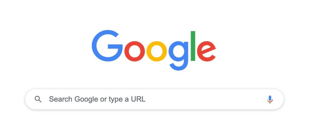
And if you’re still not convinced, some of the most famous search bars – including Google and eBay prompt users to search with a simple few words in them.

Positioning Your Search Bar: Follow The Crowd
Following the crowd often has negative connotations, but this is definitely an exception.
The majority of users are used to seeing a search bar in the top right corner of a website.
By following this simple convention, users will not be wasting their time looking for the search bar, and instead will be drawn directly to the search bar, and thus directly into a search.
Another important feature of positioning is to make sure that the search bar is visible on every page on your site.
This is because not all visitors will undertake a search from your homepage – some visitors may even click through to a different page on your site if they have been redirected, or gone straight to a specific page via a URL.
By making the search bar visible on every page of your site, visitors are never far away from it and know exactly where they can conduct a search from, regardless of where they are in their journey.
Moreover, placing the search bar on every page of your site means that you also do not miss out on any possible conversions: if a customer has a query but are three or four clicks away from your homepage, they may just leave your site and go to another site where their question can be answered more efficiently.
Design: Make it Stand Out
The design of a search bar is also a fundamentally important part of your site.
Using a universally recognised symbol such as the magnifying glass icon in your search bar makes it instantly identifiable as the area of your site in which to search.
The human brain processes visuals 60,000 times faster than text, so by integrating this icon within or next to your search bar viewers on your site almost subconsciously recognise where they can type their queries in.
Another major function of designing your search bar is to ensure that it is neither too small nor too large and is optimised for mobile shopping.
Once again, visibility of the search bar on every page and every device is a necessity if you wish to increase the number of conversions and quality of engagement.
Clutter-Free: Keep it Clean and Tidy
Relating to visibility again, it is important to make sure that your search bar is positioned clearly, and to make sure that this is the case, it is important to ensure that both your header and navigation are also clearly positioned.
The last thing you want is for your header to take up too much space, or your drop-down menus to cover the search bar.
To check that this will not happen, make sure your search bar is at the forefront of your site at all times.
Admittedly, your navigation is important, but people are not necessarily entering your site through your homepage every time they visit – in this instance, your search bar is the priority.
Make sure that there is enough space around the search bar on every page, and that it is clean; the last thing you want is for it to be hidden amid a mass of clutter and drop-down menus.
As long as your search bar is visible, your CTAs are clear, and you’re keeping your site as clutter-free as possible, you’re not only helping your visitors, but you’re also helping yourself.
Conclusions
Having a visually appealing, clear, well-designed search bar is the key to achieving eCommerce success.
Right from the very first step of attracting visitors to your search bar, to completing their purchases, the search bar is the key function to this, as well as being a fundamental link in the user’s journey towards their conversion from a visitor to a customer.
See how Salesfire can help you optimise your product discovery experience, email one of our experts at [email protected] or book a free demo of our personalisation tools.


