Six Design Tactics to Supercharge Your eCommerce Sales
By Velstar • Last updated: Tuesday Jan 20th, 2026
These days, web design is about more than just making a site look good.
Your store needs to not only engage users but convert them into customers and keep them coming back for more.
This is where conversion-focused design comes in. Adopting tried and tested design principles to evoke a response, minimise distraction, optimise the customer experience and ultimately drive revenue.
Conversion-focused design is important because it ensures that every design choice you make follows best practices and is data-led to set you up for the best possible chances of success.
In this article, leading Shopify Plus agency, Velstar, shares six conversion-focused design tactics that you can implement right away.
1. Mobile-first approach
It’s no secret that mobile traffic is on the rise and has significantly surpassed desktop in recent years, so it’s imperative that your eCommerce store is designed with mobile users in mind.
Designing with a mobile-first approach forces you to prioritise content ruthlessly, removing unnecessary clutter, which ultimately enables you to create a simpler, more intuitive user journey.
2. Super fast performance
47% of customers expect a webpage to load in two seconds or less. That’s a short time and every second counts.
The key to designing a super-fast site is optimising site images, implementing a minimalistic design and avoiding large media files.
3. Minimalism is key
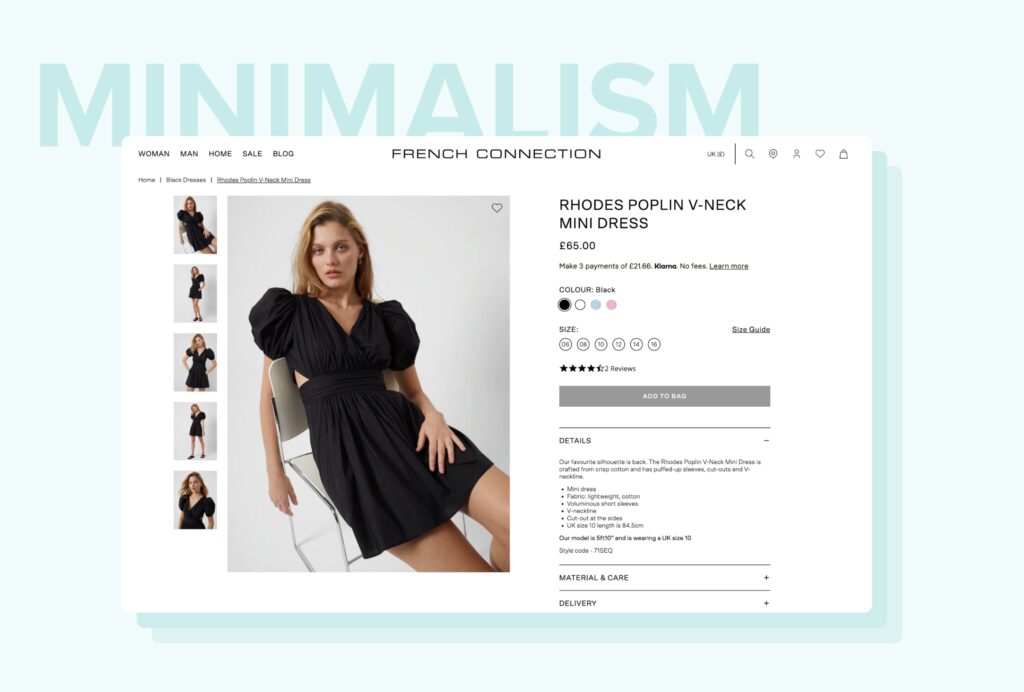
On the topic of a minimalistic design, it helps remove the barriers to purchase and puts your products centre stage, making the shopping journey seamless.
Too many elements — text, images, pop-ups, sliders — can distract the customer away from the checkout.
So, ensure you keep your design clean and concise, particularly on your product pages, just like on the Shopify Plus store we designed for the iconic fashion brand, French Connection.
4. Keep important information above the fold
Another way to improve conversions is to keep important and compelling information above the fold.
This is the content that appears on the screen when a page first loads. Below the fold appears after a customer starts scrolling.
This should be the case across all devices, so whether your customer is shopping on their mobile or desktop, all the important elements are above the fold.
The key to success when it comes to the fold is that any content needs to engage a customer right away and make them want to stick around. Here are some ways you can do this:
- Make sure your unique selling proposition (USP) is clear, so the moment a customer lands on your store they know who you are and what you’re selling
- Include primary copy if you think this will add value, but ensure it’s short, snappy and addresses your customer’s problem
- Use high-quality static imagery or video to catch your customer’s eye
- Clear call-to-action (CTA) button, such as ‘SHOP NOW’, ‘SHOP WOMEN’, ‘SHOP MEN’, to speed up navigation and improve user experience
- Use different coloured text if all your copy on the page is one colour, but make sure it’s on-brand
- Visual cues to encourage interaction
- Animations
- Social proof, including reviews
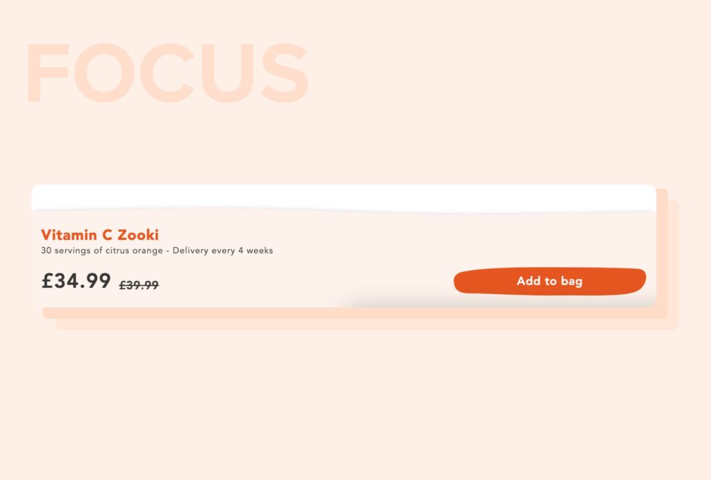
An additional way of ensuring important content is above the fold is to introduce ‘sticky’ content. This is where content is fixed in the same place, regardless of how long the page is.
This can be exceptionally valuable on product pages. Take health and supplements brand Zooki for example. They feature a sticky ‘Add to Bag’ banner to ensure that no matter where the user is on the page, the focus is always on checkout.
5. Inclusivity and accessibility
It’s imperative that your online store is inclusive – it strives to make all users feel welcome and included.
Regardless of their capabilities or disabilities, users should be able to navigate around any site easily. Ask yourself the following questions when designing your store:
Does your site provide equal access to those with diverse abilities?
Is your on-site content, including product imagery, catering to your entire target audience regardless of gender, age, race, size and abilities? For example, if you’re a cosmetic brand, are your makeup swatches inclusive of all skin types, just like Sculpted by Aimee:
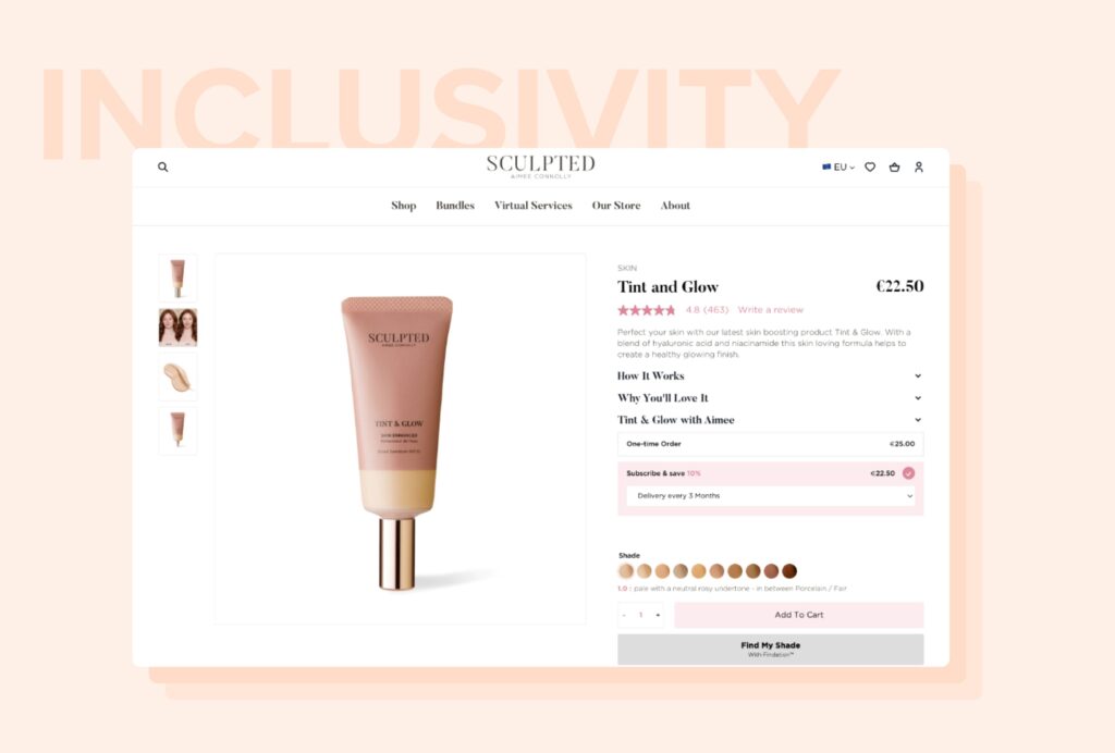
At Velstar, accessibility is a top priority of ours. That’s why our expert team of UX/UI designers and developers ensure that all our designs meet W3’s AAA accessibility standards.
6. Incorporate user generated content
User generated content (UGC) is without doubt one of the most powerful tools a merchant can use to convert more customers.
This is because it not only helps improve search rankings and overall SEO efforts, but it also boosts brand trust and authenticity.
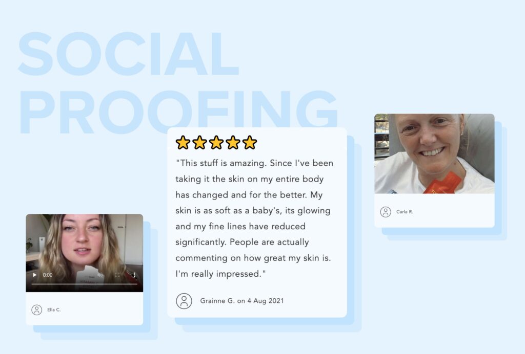
There are lots of different ways you can feature UGC on your store, including reviews, testimonials and Instagram feed implementation, but we recommend using as many as possible on key landing pages to give a layer of credibility to the overall shopping experience, in the same way Zooki has below.
Wrapping up
In summary, when designing your online store, you must remain true to your customers’ wants and needs, no matter what.
You should always design with mobile and speed in mind, as well as simplicity and accessibility to ensure everyone has an enjoyable shopping experience.
What’s more, your store should help customers make easy purchasing decisions, not confuse them. And don’t shy away from using UGC as it can help forge a deeper connection with buyers to drive conversions.
If you’d like to discuss how to implement these tactics for your eCommerce business, get in touch with our team of conversion optimisation experts today. We’ve helped countless brands, including French Connection, AVON, Castore, Linda Farrow and many more create memorable shopping experiences that their customers love, and we can do the same for you.
See how Salesfire can help you optimise your product discovery experience, email one of our experts at [email protected] or book a free demo of our personalisation tools.

